 With the football season drawing to a dramatic finale, thoughts of supporters inevitably turn to the next campaign on the other side of the summer, and the possible signings, preparation, pre-season friendlies, and the new kit which your team will be running out in.
So what does Manchester United’s new football kit look like? Read on…
United fans certainly had to wait to hear when the football club was planning to unveil the new, official kits. Such was the interest from supporters, rumours had been flying about the forums, Facebook, and Twitter about the club’s new kit for the 2012/2013 campaign, before it was finally launched last week.
The Red Devils are sticking with Nike football kits in the current home and away colours with black collars on home kits and blue ones on away kits. Upon its launch Nike were keen to emphasise the thinking and inspiration behind the design of the kit.
The new kit has a distinctive, gingham print running through the fabric in homage to the club’s history, having been borne out of working-class values such as respect, hard work, and responsibility – all of which have played a part in building a club defined by glory. The check print doffs its cap at Manchester’s growth from a small market town to a global centre of cotton textiles.
There’s even a motto stitched inside the collar of the shirt that says, “Forged in Industry, Striving for Glory.”
Whether it’s the red of Manchester United, the blue of Chelsea, the claret and blue of Aston Villa, or of course the plethora of other colour combinations available to professional teams, the fact is that staying on-trend with your terrace buddies can certainly cost you a few quid. It is in only in relatively recent football history that this revenue stream has been opened up by enterprising clubs and kit companies, and in years gone by, members of the same team were wearing different outfits, albeit in similar colours.
In 1857 the rules of the Sheffield Football Club led the way with a requirement that players should don a flannel clap in red and blue. It wasn’t a very grand start, but in truth it was a forerunner of the modern-day Nike football kit.
Of course there have been some real design disasters where football kits have been concerned. Who can forget Arsenal’s rather disorientating “bruised banana” kit, worn by the Gunners in 1991 or the “bird poo” kit worn by Norwich in 1992?
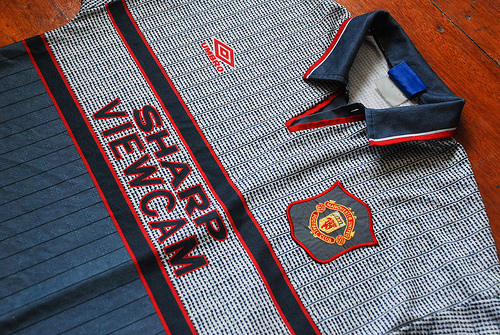
And then there’s the little grey number which was worn by Manchester United players in 1996. Losing 3-0 to Southampton at half-time, Alex Ferguson made his players change into their third kit, and the grey kit was never seen again. Ferguson famously said he did it because the players weren’t able to recognise each other.
Football fashion has certainly had its fair share of abominations over the years.
Picture Credit: Fendyzaidan


